

This year, 2007, marks the 30th anniversary of the Atari 2600 release, which is what many consider to be the very first commercial video game console. And since then, the gaming populace has been privy to 21 major home consoles. To celebrate this momentous year, I have painstakingly researched and categorized each of the 18 home consoles’ logos. Yes, I have nothing else better to do with my time. So, with that in mind, let’s take a quick stroll through history, shall we?

Atari 2600: Here we have the granddaddy of them all: the Atari 2600. I don’t really understand what this logo stands for, but it must mean something cool, as it can still be seen on t-shirts and stickers everywhere. If you’re trying to convey the fact that you’re a retro gamer, you probably have the Atari logo somewhere in your gaming bordello. Interesting bit of trivia: the logo was even featured in the cult classic, “Blade Runner.” After four major company restructuring periods, the main focus of the logo still stands strong today.

Nintendo Entertainment System: Although the NES is regarded as possibly the most popular console ever made, the logo probably wasn’t the reason why. You have the generic logo that Nintendo uses for itself, and “Entertainment System” written beneath it. Yeah, not much to look at, really. I love you Nintendo, but this just isn’t what we expect from you. I’m sure it was the fact that no one gave a damn about video games when the NES came out, so a more subdued logo was the only way to get consumers to give you a chance. Apparently it was successful.

Coleco Vision: Some will be amazed that I even listed this, but hey, I had one and that means it gets listed. Like the NES, there’s really not much to see. “Coleco Vision” in rainbow lettering wouldn’t be my first choice, but it was always more of an actual toy than a gaming console, so whoever made the logo hit the nail on the head.

SEGA Master System: The Master System was the very first SEGA console in America. It was basically SEGA’s answer to the NES. Sadly, it never really caught on, as most people seem to only remember the Genesis. And as we can see, SEGA was apparently still holding back on that edgier attitude that we would come to see from the company in the next few years, as the logo is as boring as the NES logo.

SEGA Genesis: Now we’re talking. The Genesis was the system that put SEGA on the map. For all those gamers out there that were getting sick of the cute games that were being released on the NES and SNES, SEGA brought to the industry an attitude that some still swear by. You can kind of see it in this logo, what with the metallic plaque surrounding the very sharp and jagged Genesis lettering.

Super Nintendo Entertainment System: The American version of the SNES logo is barely a step up from the NES logo. Take out the oval, put “Super” in the front, and italicize it all. Hardly super in my mind. Now the Japanese logo, that’s a different story. Sleek, simple, and semi-colorful. Not as amazing as the Atari logo, but still a great effort from Nintendo. Interestingly, Americans could actually see this logo on those plastic cartridge protectors.

3DO: After Trip Hawkins left EA, he went on to release the predecessor to the PS3: the 3DO. And by that, I mean they are priced almost exactly the same. As for the logo, we have a circle, spherical cube, and a sharp-edged cube levitating in the air. Aside from redundant square-based shapes, the logo is pretty appealing. I’d have to say it’s the best one for the time, with nothing matching it until the PS1 logo.
*Updated to correct three shapes logo

TurboGrafx-16: This is actually one of the more intriguing logos. This must have been devised when the whole “bits war” was going on. Instead of having commercials scream at the person about how many bits the system was running, NEC skipped all that and put the number in the logo. But it’s definitely a more eye-pleasing logo when compared to the rest at the time.
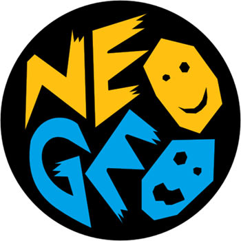
NeoGeo: If you look at this thing closely, it’s actually kind of freaky. The faces are basically cardboard cutouts, with sharp angles pertruding everywhere. It looks like something you’d see in a book about voodoo. This is, in my opinion, probably the worst logo of them all. It just looks weird.

Jaguar: This one is freaky, but in a stylish and modern way. The font is scraggly on the edges, and it has the ‘R’ with the claw marks. It’s more of a type-based logo, with very little emphasis on the eyes. And they seem a little small to me. I think they were on to something, but didn’t go far enough with it. Lost potential, I say.

SEGA Saturn: After something like the Genesis logo, the Saturn seems a little pussy to me. It’s cool to have a planet as a logo, but the metal ring surrounding it is just too wimpy for my tastes. Maybe the size of the ring represents how many games came out for it?

Sony Playstation: This logo has actually been used for the Playstation brand in general, and has appeared on every Sony console up until now. For 1995, it’s pretty cool. It brings the idea of 3D to the forefront, and somehow reminds me of the whole “multimedia” thing that everyone seems to like. As for a logo now, it’s definitely in need of an upgrade. And it totally needs an “A” for arrogance in there somewhere.

Nintendo 64: Following the footsteps of the TurboGrafx-16, Nintendo decided to slap the consumers noggin with one of the system’s hardware specs by putting a big 64 right in the logo, based on the fact that it ran as a 64-bit machine. In retrospect, this logo is pretty similar to the PS logo. Same colors, same 3D-ness. With a track record like Sony’s, I’d say that Nintendo probably came up with it first. Just like rumble, the analog stick, motion control, etc.

SEGA Dreamcast: Poor little Dreamcast. You were such an innovative piece of gaming history. Even your logo was innovative. It was also probably the first example of where a logo was animated when the system was booted up. And the fact that the line is a little scribbly made it seem like the company was trying to show how devoted it was to making games with a more stylistic approach. Still one of my personal favorites, too.

Nintendo GameCube: Oh jeez. Nintendo messed up by releasing the system in that cute purple color, and it seems the logo fell to the same affliction. Reminiscent of the N64’s “3D-ness,” the GameCube logo was actually kind of a cool design. Got the whole cube look down perfectly, and it’s nice and simple. Color choice aside, Nintendo did a pretty good job with it.

Microsoft X-box: Microsoft’s first foray into the console race had itself a logo that just screams “marketing campaign.” It’s neon green, and was a giant X. If that’s not 90’s trendy, I don’t know what is. And I’m sure they paid a hefty price tag for this gem, too.

Nintendo Wii: Although this is very much in line with what Msoft was trying to do with the Xbox, Nintendo made a wise choice to go with the name Wii. It’s short and sweet, and is rife with that whole “i” thing that Apple started. It’s trendy to the point of nausea, but it’s not as annoying as say, a big green X, and I have to say they pulled it off rather well.

Xbox 360. I’m not really sure what the system’s actual logo is. It can either be the Dreamcast rip-off with the circles, or it an be the spherical neon X that you see when you boot up the system. The circles annoys me, seeing as how they stole it (among other things) from the Dreamcast, and the X-sphere is just an evolution on the original Xbox logo. I guess it’s not the worst thing possible, and it is a lot better than what Sony does with it’s home consoles’ logo (read: nothing). I also like the animation of the X digging into the sphere. Very trippy, indeed.
So there you have it. Anyone have a personal favorite? I’m sure one of you has a wardrobe just filled with these suckers. I know I do.
The Comments on Analogue Stick, the 1st Console to have that was not the Nintendo’s (N64) or Sega’s (Saturn), but it was the Atari 5200, in fact it was an acheles heel for the machine, since it did not have the springs to auto centre the thing.
But as Commercial consoles go it was the 1st to have it.
and as Analogue goes, the “Paddle” used by atari for everything including “PONG”.
And as motion sensing, Sony has patents on that in a game console controller going back to the late 1990’s
if you look at the early PS3 pics they had at the “Boomerang” Controller, imagine holding that thing in your hands as a steering wheel…… could that be a hint at motion control driving?
Just my $.02
and a note, I am not a sony fanboy, I don’t have a PS3, I do however own a Wii and a Xbox 360.
Well done mate, you were wondering what the ATARI logo was supposed to be… just to let you know the ATARI logo is symbolic of Mt.Fuji near Tokyo Japan. Mt.Fuji is one of the most powerful symbols in the Japanese culture.
Cheers!
[…] Link From videolamer.com […]
[…] read more | digg story […]
yup. is mount fuji.
[…] Console logos throughout the ages (Videolamer) Enlace Permanente | Enviar por email a un amigo Más anotaciones de: General, Consolas […]
The XBox 360 logo was based on the Baked Potato. True story.
LOL, this was the most biased, and ignorant article I have read in ages. Grow up and play a game console because you like it, not because you think it hasn’t stoeln ideas from oehrs… because nintendo was stolen it’s fair share of ideas.
[…] Click here to read more | Source […]
Hello everyone, this is Matt from videolamer, and I’m the writer of this much “biased” article that everyone is digging, but also sippin’ on the haterade about. I just wanted to clear up some misconceptions about the piece before I get anymore hate-comments. First, I’m not a graphic artist. I can’t use photoshop, and I never went to art school. If I tried to decipher these logos on a artistic approach, I’d be completely offbase with everything. I wrote this as a video game consumer, nothing else. If I wrote up detailed analysis for them all, the damn article would have turned into a book. I wrote this for all those skimmers out there, and apparently there’s enough people that dugg it to say I may have succeeded. Secondly, I think people were expecting something different when the title of the digg article was talking about the History of it all. That sounds like I would have interviewed every artist that worked on them, and how they came to be. Sorry, but that I don’t have time for that. Again, this was just a skimming article for those short attention spanners, but I do apologize on the misconception. That’s my bad. Also, I do apologize on the incorrect 3D0 logo. I tried searching, and all I came up with was the text, and I’ve never played 3D0 before, so I never saw the one with the diamonds and such. Again, my bad. But I’m sure some of you have clicked on the links that proved me wrong, so I’m not even going to bother correcting myself. As for Intellivision, I thought I was pushing the limit with Coleco Vision, so I stopped there. I didn’t mean to say it sucked. And after looking at the logo with the track-runner guy, I would say it was cool for the time. And as for not including PS2/PS3, I still feel that Sony has defined their logo as the Playstation Brand one, and I would imagine there wouldn’t be much to say on just the Spideyman Lettering that hasn’t been said before. And apparently my writing wasn’t witty enough, so maybe I need to go back and brush up on my “wittiness” skillz. Thanks for all the constructive criticisms. Hopefully, when the dust settles from all this, I will write an article on the handheld systems. But I do like to thank the seemingly few that gave me thanks in the comments. You guys made this a lot easier for me, and I would like to say thank you.
Also, to the guy that said I contradicted myself with the GAMECUBE logo. Everyone hated that color for the GameCube, that’s pretty much fact now. I still like the logo, concerning its design, but the color choice could have been better. I didn’t change my mind mid-sentence or anything. So blah.
[…] Console logos throughout the ages – videolamer.com This year, 2007, marks the 30th anniversary of the Atari 2600 release, which is what many consider to be the very first commercial video game console. And since then, the gaming populace has been privy to 21 major home consoles. To celebrate this momentous year, I have painstakingly researched and categorized each of the 18 home consoles’ logos. […]
fairplay for dispelling any negativity that was strting to sppear. :) sumtyms ppl are just nasty because they got nuffin better to do.
P.S. PC?? lol
Videolamer is actually full of overly long in depth articles so feel free to look around. No one diggs those, of course.
This may be totally off base, but my understanding of the gamecube color that everyone hates is that it originated from the CGI series Reboot, where they referred to the incoming games as gamecubes.
Could be way off base, but it makes sense
this is fucking stupid. “this is kinda freaky” blah blah blah. wow, what an enlightening bit of commentary. how did this get on front page? it’s retarded.
Other than the fact that the author was completely wrong about the 3DO logo, I felt it was a good article.
Here is the actual logo, as depicted on console startup and every game box / jewel case.
http://www.consoleia.co.uk/systems/3do/3do/3dologo.gif
jake, I’m pretty sure it got on the front page because enough people liked it and clicked the “Digg it” button. That’s what tends to happen with these sorts of things.
There, ya happy? I updated the 3D0 logo, with some more crappy commentary. Sheesh:)
Completionists unite! Where’s the Nuon, Intellivision, PS2/3, Gameboy, Game Gear, etc. etc.?
Nice article, I liked it. And if the main complaint people have is “more more more!” then things aren’t going too bad for you.
Fun read. This article isn’t “biased”. It’s infinitely bizarre to me that CORPORATIONS have fanboys.
[…] atari’sinden, playstation‘ına kadar bir çok oyun konsolunun hikayeleri ile birlikte logoları tanıtılmış… […]
I’m not a fan of corporations, I’m a fan of interesting people. I thought Amiga was cool because of people like Jay Miner, who’d previously designed the chipset of the Atari 400. I thought was the coolest thing ever when I was 10, and the Amiga impressed me similarly. I followed Nuon because of Jeff Minter’s involvement since I knew of his psychedelic Amiga games. I was enough of a fan of his work to even own the JaguarCD which he did the Virtual Light Machine for. I thought Trip Hawkins had some good ideas with the multiplayer, though sadly he didn’t understand price points at 3DO any better than when he was at Apple. I think Peter Moore is cool, for some strange reason, and I’ll probably get a 360 some day since I liked the Dreamcast so much. I admire people like H.S. Warshaw who made names for themselves at Atari in the early days despite the company trying to hide their identities. If games are ever to be taken seriously as art, there needs to be more than a corporation to give the credit to.
[…] Videolamer comes a collection of logos from the console game systems we’ve known through the years. I owned three of these, […]
[…] videolamer.com» Blog Archive » Console logos throughout the ages Dude painstakingly researched and categorized each of the 18 home consoles’ logos. (tags: consoles gaming logo design) […]
to get even geekier, the nintendo 64 logo may have something to do with the fact that the console, at 64 bits, is the square of the nes (8×8).
[…] Gaming Console Logos Throughout The Ages: hey, I like that Neo-Geo logo. […]
I love how the sonyfans complain about the PS2 and PS3 not being up there. C’mon these consoles didn’t even HAVE individual logos. The PS2 just has a couple of blue lines on the side and for the PS3…wow, they ripped off the Spider-Man typeface. Real original. Just like everything else in that overpriced POS.
The 3DO typeface is Bodoni, not Century Schoolbook.
[…] Gaming Console Logos Throughout The Ages: hey, I like that Neo-Geo logo. […]
dreamcast rulez the universe.
You’re right jtw400, Bodoni Bold. In my defense, when the article was first published there was a different image there, and that one I believe did use century schoolbook. If you read up a ways in the comments, there’s discussion about how the original image wasn’t their actual logo.
What about Playstation Logos?
[…] videolamer.com » Console logos throughout the ages (tags: logo design grafik-design games gaming konsolen) […]
[…] Game console logo dissection. […]
This is a very very early Atari Logo. Back in the days when it was called Syzygy: http://tinyurl.com/yqtsce
Here is a newer Atari/Syzygy Logo:
http://www.atari-computermuseum.de/pics/logos/logo_atari_72.gif
Thanks Fract, it’s really cool to see the ones inspired by go.
[…] Console logos throughout the ages […]
[…] read more | digg story […]
[…] – videolamer.com» Blog Archive » Console logos throughout the ages … ve Hikayeleri : Ä°nternet ve YaÅŸam Says: May 3rd, 2007 at 3:28 pm […] atari’sinden, playstation‘ına kadar bir çok oyun konsolunun hikayeleri ile birlikte logoları … » Devamı […]
nope.. Intellivision is not a position in Go, sorry
You know what Matt, I really enjoy your writing on VL, but i find it sad that what gets over 1500 diggs is not an article of yours that actually represents your writing and is substantive in terms of originality, but one that required you to just do research. I guess what i’m saying is that you have written many more articles that deserve to be dugg a whole lot more.
I’m kind of contemptuous of people who like lists. “Another sweet list from VL, sweet dude, hehehe” To these people I wanna say: well fuck you, have you read a single article of Matts on this site or is reading just not your thing and list are easier to digest for your feeble brain.
Sorry for sounding angry but i guess i am a bit ticked off that other stuff of much higher quality both by you matt and the rest of the staffers, does not get as much attention.
I understand where you’re coming from Shota, and I appreciate the near (but not quite) back-handed compliment. That’s why i officially hate Digg. People want 5 second chunks of interesting info while eating lunch, and nothing more. You do get a few good ones reading the more intelligent commentary, but the majority want that last bite of McD’s to be filled with a Top 10 list.
Again, thanks for the praise, I really appreciate it:) Your comment has increased my motivation level to at least a 5 out of 10 now.
[…] read more | digg story « Top 10 Most Violent Video Games More ‘Filthy’ Games to Drive Fox News Crazy » […]
[…] read more | digg story « Top 10 Most Violent Video Games Spectacular Meteor Caught on Video during Football Game » […]
wow
I find the concept of this article very interesting, but it seems that a good deal of research was not done at all. Each of these identities has a meaning and a purpose be it color, shape, typography or design not to mention plenty of console identities have been left out. The Magnavox Odyssey was the first home video game console with cartridge based play.
Hey I’ve just come from a random part of the internet. I read half of the title of this article and then I Page Dned to the bottom to suggest, because I don’t think anyone else has suggested it yet, although I wouldn’t know because I only read the first two words in this articles title, but anyway I would just like to suggest that you perhaps you could feature the Intellivision logo yeah?
Yeah I know I’m a dinosaur gamer, but what about the system I had. It was just before Atari 2600. It was called the Odyssey 2000! In some ways I thought that system was better!
That is cool, but you missed lots conosles, like Sega GAME GEAR and Gameboy and SG1000!I say more logos!