

This year, 2007, marks the 30th anniversary of the Atari 2600 release, which is what many consider to be the very first commercial video game console. And since then, the gaming populace has been privy to 21 major home consoles. To celebrate this momentous year, I have painstakingly researched and categorized each of the 18 home consoles’ logos. Yes, I have nothing else better to do with my time. So, with that in mind, let’s take a quick stroll through history, shall we?

Atari 2600: Here we have the granddaddy of them all: the Atari 2600. I don’t really understand what this logo stands for, but it must mean something cool, as it can still be seen on t-shirts and stickers everywhere. If you’re trying to convey the fact that you’re a retro gamer, you probably have the Atari logo somewhere in your gaming bordello. Interesting bit of trivia: the logo was even featured in the cult classic, “Blade Runner.” After four major company restructuring periods, the main focus of the logo still stands strong today.

Nintendo Entertainment System: Although the NES is regarded as possibly the most popular console ever made, the logo probably wasn’t the reason why. You have the generic logo that Nintendo uses for itself, and “Entertainment System” written beneath it. Yeah, not much to look at, really. I love you Nintendo, but this just isn’t what we expect from you. I’m sure it was the fact that no one gave a damn about video games when the NES came out, so a more subdued logo was the only way to get consumers to give you a chance. Apparently it was successful.

Coleco Vision: Some will be amazed that I even listed this, but hey, I had one and that means it gets listed. Like the NES, there’s really not much to see. “Coleco Vision” in rainbow lettering wouldn’t be my first choice, but it was always more of an actual toy than a gaming console, so whoever made the logo hit the nail on the head.

SEGA Master System: The Master System was the very first SEGA console in America. It was basically SEGA’s answer to the NES. Sadly, it never really caught on, as most people seem to only remember the Genesis. And as we can see, SEGA was apparently still holding back on that edgier attitude that we would come to see from the company in the next few years, as the logo is as boring as the NES logo.

SEGA Genesis: Now we’re talking. The Genesis was the system that put SEGA on the map. For all those gamers out there that were getting sick of the cute games that were being released on the NES and SNES, SEGA brought to the industry an attitude that some still swear by. You can kind of see it in this logo, what with the metallic plaque surrounding the very sharp and jagged Genesis lettering.

Super Nintendo Entertainment System: The American version of the SNES logo is barely a step up from the NES logo. Take out the oval, put “Super” in the front, and italicize it all. Hardly super in my mind. Now the Japanese logo, that’s a different story. Sleek, simple, and semi-colorful. Not as amazing as the Atari logo, but still a great effort from Nintendo. Interestingly, Americans could actually see this logo on those plastic cartridge protectors.

3DO: After Trip Hawkins left EA, he went on to release the predecessor to the PS3: the 3DO. And by that, I mean they are priced almost exactly the same. As for the logo, we have a circle, spherical cube, and a sharp-edged cube levitating in the air. Aside from redundant square-based shapes, the logo is pretty appealing. I’d have to say it’s the best one for the time, with nothing matching it until the PS1 logo.
*Updated to correct three shapes logo

TurboGrafx-16: This is actually one of the more intriguing logos. This must have been devised when the whole “bits war” was going on. Instead of having commercials scream at the person about how many bits the system was running, NEC skipped all that and put the number in the logo. But it’s definitely a more eye-pleasing logo when compared to the rest at the time.
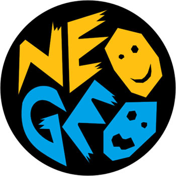
NeoGeo: If you look at this thing closely, it’s actually kind of freaky. The faces are basically cardboard cutouts, with sharp angles pertruding everywhere. It looks like something you’d see in a book about voodoo. This is, in my opinion, probably the worst logo of them all. It just looks weird.

Jaguar: This one is freaky, but in a stylish and modern way. The font is scraggly on the edges, and it has the ‘R’ with the claw marks. It’s more of a type-based logo, with very little emphasis on the eyes. And they seem a little small to me. I think they were on to something, but didn’t go far enough with it. Lost potential, I say.

SEGA Saturn: After something like the Genesis logo, the Saturn seems a little pussy to me. It’s cool to have a planet as a logo, but the metal ring surrounding it is just too wimpy for my tastes. Maybe the size of the ring represents how many games came out for it?

Sony Playstation: This logo has actually been used for the Playstation brand in general, and has appeared on every Sony console up until now. For 1995, it’s pretty cool. It brings the idea of 3D to the forefront, and somehow reminds me of the whole “multimedia” thing that everyone seems to like. As for a logo now, it’s definitely in need of an upgrade. And it totally needs an “A” for arrogance in there somewhere.

Nintendo 64: Following the footsteps of the TurboGrafx-16, Nintendo decided to slap the consumers noggin with one of the system’s hardware specs by putting a big 64 right in the logo, based on the fact that it ran as a 64-bit machine. In retrospect, this logo is pretty similar to the PS logo. Same colors, same 3D-ness. With a track record like Sony’s, I’d say that Nintendo probably came up with it first. Just like rumble, the analog stick, motion control, etc.

SEGA Dreamcast: Poor little Dreamcast. You were such an innovative piece of gaming history. Even your logo was innovative. It was also probably the first example of where a logo was animated when the system was booted up. And the fact that the line is a little scribbly made it seem like the company was trying to show how devoted it was to making games with a more stylistic approach. Still one of my personal favorites, too.

Nintendo GameCube: Oh jeez. Nintendo messed up by releasing the system in that cute purple color, and it seems the logo fell to the same affliction. Reminiscent of the N64’s “3D-ness,” the GameCube logo was actually kind of a cool design. Got the whole cube look down perfectly, and it’s nice and simple. Color choice aside, Nintendo did a pretty good job with it.

Microsoft X-box: Microsoft’s first foray into the console race had itself a logo that just screams “marketing campaign.” It’s neon green, and was a giant X. If that’s not 90’s trendy, I don’t know what is. And I’m sure they paid a hefty price tag for this gem, too.

Nintendo Wii: Although this is very much in line with what Msoft was trying to do with the Xbox, Nintendo made a wise choice to go with the name Wii. It’s short and sweet, and is rife with that whole “i” thing that Apple started. It’s trendy to the point of nausea, but it’s not as annoying as say, a big green X, and I have to say they pulled it off rather well.

Xbox 360. I’m not really sure what the system’s actual logo is. It can either be the Dreamcast rip-off with the circles, or it an be the spherical neon X that you see when you boot up the system. The circles annoys me, seeing as how they stole it (among other things) from the Dreamcast, and the X-sphere is just an evolution on the original Xbox logo. I guess it’s not the worst thing possible, and it is a lot better than what Sony does with it’s home consoles’ logo (read: nothing). I also like the animation of the X digging into the sphere. Very trippy, indeed.
So there you have it. Anyone have a personal favorite? I’m sure one of you has a wardrobe just filled with these suckers. I know I do.
[…] 18) XBOX 360 The glowing green X is an instantly recognizable symbol of the Xbox, so it is no surprise that Microsoft didn’t mess with the logo too much. The green X is embedded in a silver ball with green and gray Xbox 360 text underneath, thus symbolizing the evolution of the earlier XBOX. More details on the evolution of gaming consoles can be found here […]
[…] More details on the evolution of gaming consoles can be found here […]
They didn’t put a 64 in the logo–that’s part of the console name! Same goes for turbo graphix.